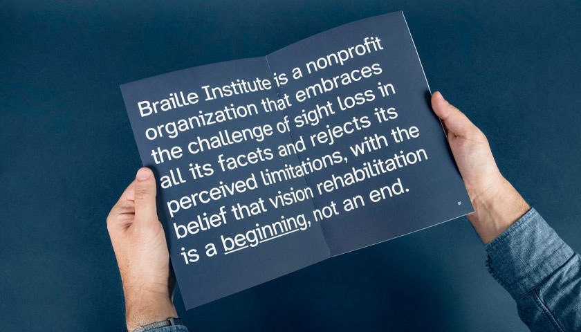
Braille Institute’s “Atkinson Hyperlegible” font family is now available on Google Fonts. This typeface was designed specifically to help with legibility and to improve readability for people with low vision and was named after Braille Institute’s founder, Robert J. Atkinson. It was named the winner in the Graphic Design category of Fast Company’s 2019 Innovation by Design Awards.
What makes Atkinson Hyperlegible unique is that it breaks the traditional typographic approach of uniformity, and instead focuses on letterform distinction to increase character recognition, ultimately improving readability.
“An imperative for Braille Institute in 2021 is promoting and spreading accessibility for those with vision impairment,” said Peter Mindnich, President, Braille Institute. “Making Atkinson Hyperlegible available on Google Fonts means countless more people who can benefit from its accessibility will be able to use it.”
“The Google Fonts team is all about providing access to the power of type. Braille Institute decided to make this font family available to everyone to use everywhere, using the SIL Open Font License. We are happy to make it easy to use in Google Workspace across collaboration apps like Docs and Slides, and the web,” said Dave Crossland, lead programs and operations manager for Google Fonts.
Atkinson Hyperlegible consists of four fonts – standard roman, bold, italic and bold italic. The fonts are available for free for anyone to use, and can be downloaded at www.brailleinstitute.org/freefont or now on fonts.google.com/specimen/Atkinson+Hyperlegible.
“Losing your vision doesn’t mean having to give up on doing the things you love,” said Sandy Shin, Vice President of Marketing and Communications at Braille Institute. “Finding an innovative way to make the written word easier to read is just one of the many things we do to help those we serve.”
Braille Institute worked with award-winning design firm Applied Design Works to develop the font and to make sure it was also ideal for designers and publishers who want to make written materials as accessible as possible for people with visual impairment.
“We want anyone interested in making written materials easier to read across the entire visual-ability spectrum to utilize Atkinson Hyperlegible,” said Craig Dobie, Founding Creative Director of Applied Design Works.