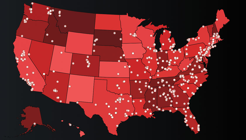
The Southern Poverty Law Center has introduced an updated, interactive hate map equipped with new features to help people better understand the hate groups operating in their state and across the country.
The new hate map allows users to view more details, including which states have the most hate groups per capita and how the number of hate groups has changed over time at the state and national levels. Users can also filter the map to show only a particular sector of the radical right, such as white nationalist groups.
The new map was introduced as the SPLC announced that it identified 1,020 active hate groups operating in the United States in 2018 – a record number and a 30 percent increase over the past four years.
“With the number of hate groups surging during the Trump era, it’s become critically important for people to understand the landscape of hate in the United States,” said Heidi Beirich, director of the Intelligence Project. “We hope the new, interactive map helps people recognize and better understand the extremist activity occurring in their communities and how it’s part of a larger movement.”
The map also makes hate group data since 2000 available for download and provides access to the latest news from the SPLC’s Hatewatch blog, which monitors and exposes the activities of the American radical right.
